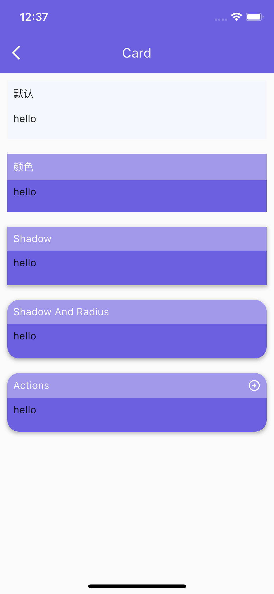
| radius | double | 0 | Card's rounded corner attribute. The rounded corner controls the four corners. Currently, it is not possible to control a single corner individually. |
| margin | EdgeInsetsGeometry | | Control of margins, type [EdgeInsetsGeometry], control its margins by calling the method of this class |
| boxShadow | BoxShadow | | Box shadow. This property is set by the user himself. It and the default shadow control can only be chosen one or the other. |
| shadowColor | Color | Colors.grey.withAlpha(160) | Default box shadow color. |
| shadow | bool | null | Whether to enable box shadow. |
| body | Widget | Must be set | Card's main area part |
| foot | Widget | | Card's tail component |
| hdBgColor | Color | transparent | The background color of Card's header component |
| hdPadding | EdgeInsetsGeometry | 8 | Internal clearance of Card’s head assembly |
| titleWidget | Widget | | Card head assembly. If titleWidget is set, the default header component will be overridden. The head is controlled by the user himself. |
| title | String | | Card's title |
| subtitle | String | | Card subtitle |
| titleSize | double | 14 | title size |
| subtitleSize | double | 12 | subtitle size |
| minHeight | double | 80 | min height of the box |
| bgColor | Color | Theme.of(context).colorScheme.background | box background color |
| titleColor | Color | Theme.of(context).cardTheme.color | title color |
| subtitleColor | Color | Theme.of(context).hintColor | subtitle color |
| actions | List< Widget > | | The right element item of the default header component |
| footWidget | Widget | | Choose one of footWidget and foot. footWidget takes priority. |
| hdSplitWidget | Widget | | The bottom split component of the head component. Choose one between this and the default split component. |
| hdSplit | bool | | Whether to display split components. Not displayed by default. |
| hdSplitHeight | double | 1 | Default height of split component |
| hdSplitMargin | EdgeInsetsGeometry | | Default margins for splitting components. |
| hdSplitColor | Color | Colors.grey[100] | Split component color |